Posts

Showing posts from October, 2017

Week 10 Begins: More Quick Paintings
Image
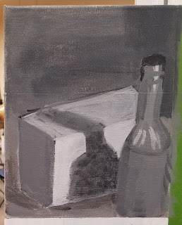
We started the day by critiquing our homework. It didn't even occur to me to put a table under my items.  Something I need to remember as we move on. As we did last week, we continued with monochromatic quick paintings. However, rather than using our Ivory black, we were instructed to get out our Ultramarine Blue and Burnt Umber. Turns out you can make fabulous bleach with these two colors. And not only that, you can tweak them to be warm or cold by adding more of one or the other.  That makes it easier to bring the focus forward or back (cold recedes, warm comes forward).  In the first painting, we had 2 items. We were instructed to paint quickly, but try to pay attention to negative space. I didn't quite manage to finish in the allotted time, however, it still is not bad. After then taking a break, Prof. Garguilo added a third item to the still life and we began again. This painting went more smoothly and I believe part of the reason is because I focused in...
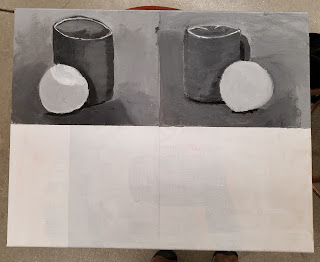
Week 9 Homework

Image
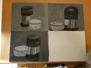
As we started last Thursday, we were to gesso a canvas and then partition into quadrants. We were to find two contrasting items to paint in monochrome paintings, using 30 minutes for each painting. I had a hard time selecting my items, but finally decided on a white ramekin and a thermos.  I think the three paintings do show improvement, with the last being the best, but this is tough work in such a short period of time.

Week 9: Movie and Quick Paint

Image
On Monday, instead of painting, we watched a documentary about Spanish painter, Antonio Lopez Garcia, and his quest to paint a quince tree he had planted in his yard. The documentary showed all the preparations and measurements he had to do as he started and continued painting. Because of weather, the painting had to be stopped unfinished, however, he continued working, changing to graphite. It clearly showed the amount of work necessary to make a masterpiece. On Thirsday, we were instructed to take a blank canvas and break it into quadrants. Prof. Garguilo then set up a still life for each of us containing 2 contrasting objects. We were instructed to quickly (30 minutes) paint the still life in one quadrant. Then he reset the objects to a different configuration. We then had 1/2 hour to paint again. The result, especially in my case, is that we became more observant.

Week 8: color

Image
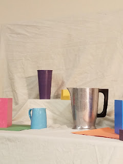
This week, we continued delving into color still life. The items were brought in by Prof. Garguilo and placed into still life settings. We actually began this painting on Thursday of week 7 and continued into week 8. W The setups were full of complimentary colors and we were to choose 4-5 items with an interesting composition. We were to concentrate on details and shadows, as well as the interesting interactions of the colors. Here's is pictures of the setup, including the portion I chose to paint. After the first class, everything was blocked or at least drawn in, however, the color of the sheet was off and I had a lot of detail work to do. In the second class, we had more time to work and the result was much better. I was able to see that the sheet actually had a green undertone. I think in the end, I was the only one to catch that and while my green shade was too dark to begin, I was able to tone it down. Again, I am having trouble with shadows and I am begin...

Homework: Color Mixing Completion

Image
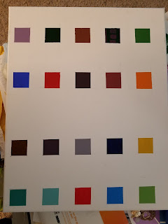
After a full day of mixing colors, I finally managed to get all 20 colors done. I enlisted John to go.around the house and find color samples for me. What is remarkable is how few actually different colors I have in my house. He would bring me something and it would match another sample I had already mixed. So the search would continue. In the end, I managed to find 20 samples and did an alright job matching. It turns out I did choose one item that I could not recreate the color because we do not have the proper base color. However, here are my finished samples alone and then with the items I used. I did have some too dark and some too light. That will take practice. I also redid the block paintings with proper complimentary colors. Much better perspective in both pictures this time.

Week 7: More Color

Image
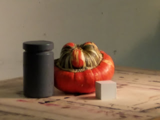
I brought in crazy vegetables today, which made my job more challenging, but I have to admit, more fun as well.  My only problem was defining the green/brow/gray color in the stripes. With help from Prof. Garguilo, we came up with something similar. Still having some perspective issues, but this painting was much better than the last.

Homework: Drawing, Color-mixing

Image
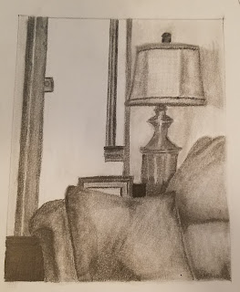
We had too much homework this weekend, and while I worked on it, I was only able to get some of each piece done in between grading. The first assignment was to do 2 drawings of still life at home. I managed one, which probably had too much in it, but I like how it turned out. Second assignment was to start mixing colors to make matches to items we find. The hard part of this will be finding samples as he has limited us to 3 of any one kind of sample, for a total of 20. My start is nail polish. The top is my colors and the bottom the nail polish. I may have to to-do 2 of these now that they are dry. The third assignment was to gesso a page in our sketchbook and draw two different angles of our little white cubes. From there, we are to use monochromatic scale from a primary color to paint the values. I managed to do things backward. I drew my cube before I gessoed, so will have to re-read the cubes before I can paint. I am not afraid to say that this is a LOT of homework ...

More Week 6: Color Still Life

Image
Today I was so proud of myself because despite a 14 hour workday yesterday, I thought I had managed to get my homework done. Of course, I was wrong. I was supposed to bring a fruit or vegetable. Ironically, I had been debating whether I had time to go to the farmers market before class. But that thought did not remind me of my homework. Thankfully, we had enough items for today's still life set-ups. We did not have a wide range of color, though, so some colored items were added. This the setup I chose to paint: This exercise proved difficult for most of us in class. Getting the colors mixed properly was an issue. I changed colors a lot. However, we were advised to "draw" with a very thin burnt Siena and then start adding color. Here is the progress. The one thing I did that really seemed to work for the fruit was to blend in a yellow on top of the colors.  However, I was very frustrated with the neutral colors. I apparently do not see them the same as others. I w...

Week 6: Adding Color!

Image
It is hard to believe we are into week six. Today, Prof. Garguilo set up more still life, but this time with one colored piece. That colored piece was set so that it's reflection showed up in a reflective piece. Thus, we had the reflection, the object, and any halo effect from the object to deal with. The still life I chose is below: I chose this still life because of the orange. The range of colors started with a gorgeous bright orange to a bright yellow. I constantly take pictures of flowers and sunsets with these colors because I find them energizing and beautiful.  Of course, the second I looked up and caught a glimpse of a coral vase across the room, I wished I had moved quickly enough to get to that still life. But by the time I saw it, too many had crowded around it. The first thing that I had to do was mix the colors. In particular, I needed to mix black.  We had to get black from a mix of primary colors. In particular, I mixed cadmium yellow medium, alzarian re...

Week 5 Homework

Image
To prepare us to move into color painting, we were instructed to create value scales for red, green and blue. Each value scale contained 11 1.375" squares. We were instructed to put each scale about 1/2" from each other.  I guess I should have guessed that we would be using the rest of the canvas for our next in-laws project. I began by mixing my three middle tones. To do this scale, we had to use complimentary colors for the dark values. Since we had to create red and green for two of the scales, it just made sense to begin there. I started with the green scale. Each step required adding more and more red to get the next darker shade. At the end, in order to get black, I did have to add additional blue (a component of green).  To finish the scale, I returned to the original green and used white to make lighter values. I repeated the process with the red, mixing green to get the darker reds and adding white to lighten the values. This is as far as I managed to finish i...