Posts

Showing posts from September, 2017

Monochromatic with a twist

Image
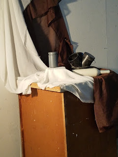
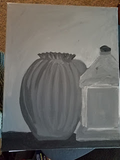
Today, we explored monochromatic painting again, but this time with a twist: we had to choose red or black and use a range of values from white to black. To accommodate a wider range of values, Prof. Garguilo provided some different items that were charcoal and/or flat gray, as well as some new, interesting shapes.  I tried to see about changing still life, but the other two setups had too many working at them and I couldn't get a good angle to get shadows. So, this will look similar to the still life I have been working on for the black monochromatic paintings. First, here is the arrangement: In case you can't tell, the upright piece on the right is a clock weight and it drove me crazy today. At the first break, I had much of the blocking done. And I had the front block pretty well finished. The pot, however was getting muddy, so I needed to walk away for a bit. I also realized the background and shadows needed work, so, I spent time going between the various s...
Week 3 Homework

Image
The homework posts are backward because I had to go to training when this one was assigned. However, I finally got to complete this. This was more still life/monochromatic practice. And now that I am taking a picture, I see that I need to repair it a bit. I have this beautiful blue glass vase that is interesting because of variations in thickness of the glass. I have tried to draw this vase to no avail, so I thought I would use it for this homework. Problem is, I couldn't decide what else to put on the picture. It happened that my Murphy's Oil Soap bottle was nearby, so I thought it was an interesting contrast. This is what resulted. As you can probably see, the vase has a "hunchback" problem on the right. I will have to fix that before turning this in.  After some repairs, this is the result was this. There is still an issue with coverage. Close up, you can still see canvas through the paint. This is something I am working on.

Week 4 Homework

Image
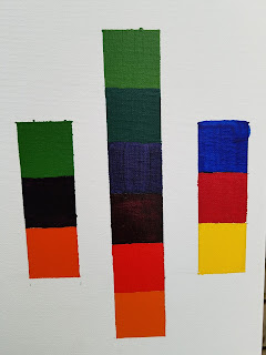
This week, we will be moving from monochromatic painting to using color. For homework, we needed to create a value chart of colors. The color scale is broken into primary, secondary and tertiary colors.  Each color is created from 5 paints. These paints are combined based on a color wheel chart to create each color. We did not have every color listed on the recipes, so I had to adjust the mixtures accordingly.  For example, one of the colors called for cadmium yellow medium. I, however, only had cadmium yellow light. This changed the mixture needed for that color. This was a more finicky project because while you think you are able to eyeball the mix, it really is difficult to be accurate. Especially since some tubes had larger necks than others. I can definitely see why it would be good to have all the same size tubes.

Week 4: Still Life, Part 2

Image
This week, we further explored still life with monochromatic painting. Prof. Garguilo created 3 setups around the room. These contained boxes and balls plus black and reflective items. The three displays follow: The goal of this exercise was to recreate the still life paying close attention to values, including the values in the reflections. We were given two class periods to complete out paintings. I chose the first still life because I liked the challenge of the reflection.in the coffee pot. The stark contrast of the black and white items also intrigued me. After the first class session, I had a good representation of the still life, however my perspective was slightly skewed on all of the items. As we started class on Wednesday, I knew I had to get the perspectives fixed on each item, plus work on the values in the blocks and ball.  The black brick was the easiest item to fix. I had spent quite a bit of time studying my photograph and realized that not only was...

Class 3: First Foray into Still Life

Image
Today we were asked to created a still life using different colored fabrics and one white, one gray , and one black item. Then, we were to work on painting those items using the value scale we created for homework. The hardest part of this assignment was finding the three requisite items. Somehow, we ran out of black items, so we ended up with a strange three-day pipe. Three of us worked together to drape the fabrics and arrange the three items into an interest still life. I am a bit relieved because they will be continuing to work on these paintings on Thursday when I have to miss class. I made some pretty great progress, so I don't feel like I will fall behind too much.

Homework: Value Scale

Image
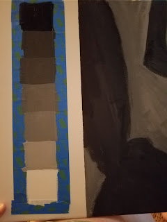
Our homework this week was to create a value scale from titanium white to ivory black. In the space we taped off on our canvas last week, we were to set up a row of seven 2-inch boxes. We were to start with our medium gray and then create even values between that medium gray and the black and white on either end. I have to admit, while tricky, it was much easier than creating a value scale of India ink and water in 1-inch squares during the drawing class. Two more rules: tape and even strokes. I think I did a pretty good job meeting these two rules, although it was a bit messy with the tape.

Class 2: Monochromatic Painting

Image
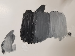
Today, we delved into the world of monochromatic painting. We reset out still-life's from last class at the beginning of class. Then we spent some time working on mixing paint. The goal was to create three different values of gray by mixing black and titanium white. After we had successfully created these values, Prof. Garguilo explained that we would recreate out still life using a dark gray and a light gray. He asked us to work doing blocking of large areas, ignoring details. This weekend, we have an assignment to create a value scale from black to white.

ART223 Week 1

Image
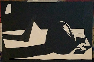
As part of my Intro to Painting class, I have been asked to set up a blog.  This blog will follow my painting journey to begin with.  I hope to continue using it after this class to keep track of my art journey.  Week 1: We created images using black and white paper. Still lifes were set up in three locations in our darkened studio.  We were given instructions to first take a picture of the still life you would like to create and make the photo a black and white that merged the grays into the black.  Once we had that approved, we then had to create a picture, using only white and black paper by squinting to meld the dark and white.  Thankfully, I am pretty much blind, so it was easy to blur the vision for me just by taking off my glasses.  Here are my two images.  The first is my paper image, the second my photograph: We were told to bring them back this week and I have to wonder if we will paint them next.